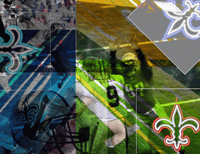
With the postcard, I was trying to achieve the satisfaction of making a cool-looking design I would actually be proud of. I chose graphics that dealt with football, more specifically my favorite team, the New Orleans Saints. It doesn't really apply to the quote, but it's football season and it was something I was into.
I changed around the hue and saturation a lot to add some color to it, as the teams colors are white, black, and gold - which go well with many colors. I obviously layered the pictures so they were all visible even if overlapping, and I feel I accomplished my goals.
I was having a hard time adding colors to the right parts, as it would often be too dark or light to see a certain picture in the group. However, with much trial and error I was able to get the placement right and the colors to look good where they were without too much contrast.
I'm most proud of how I used several pictures of my favorite sports team to make one visually attractive picture full of color, sweet pictures, and of course the Saints. If I had more time, I guess I would add a few more detailed pictures of players or logos to liven it up a bit.
Very Colorful. I like this type of colorful Postcards very much. Generally People love sending very colored cards.
ReplyDelete