Sunday, December 19, 2010

Final Project Photos

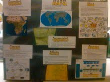
Here are the pictures of each side of the box that we made for our final project.


Monday, December 13, 2010

Final Project Rationale

Group Rationale:
For our final project in Visual Communication, we chose to represent our design on a cardboard box. We knew from the beginning that we wanted to depict what we had learned on a 3-dimensional object, because we felt it would be the best way to show the various aspects of what we needed to include. We also knew that the object needed to be large enough to accommodate all of the appropriate information.
We chose a medium-sized box because a) it is large enough to fit the needed visualizations and b) because it had the proper amount of sides (we had chosen to break up the course into four separate sections--maps, terms and definitions, key terms, and charts/graphs; thus, the box's 6 sides were more than enough for us to display our topics). Though we knew we would later cover the box in various types of graphics, we realized that to leave the box in stock shape would not be very visually stimulating. As such, we spray-painted it with a base coat of green, adding yellow, red, and blue accents.
We then split up the assignment into four parts, since there were four of us, and each took the topic with which we felt the most comfortable. From here, it was easy to create visualizations using text and pictures, and organizing them into a visually appealing package. Each side is also somewhat different, reflecting our own unique styles and providing some visual interest. Though we initially began the project individually, we were able to successfully come together in the end and create a unified product. Our "aha" moment probably occurred when we tried to lay out our respective visuals; some of them didn't fit, and we had to collaborate and re-print or re-draw some of the subjects for them to work together more cohesively.


Individual Rationale:
For the final project, since we split up the 4 sections we chose between the 4 members, I was in charge of the maps. I didn't have any problems with choosing what maps to include because we only had so many, but I did decide to go into more detail about some of the maps we didn't discuss as much. We talked a lot about mind, concept, and affinity maps, so I was sure to include enough information on them. However, in my notes I also found geographic, topographic, and process maps. I did a little more investigating on those topics and decided to include them as well. I guess that would be my "ah-hah!" moment, because it was when I figured out what else to use to fill the blank space on our box. I was most intrigued by the process maps, because of the way it's used with many businesses. This is probably due to the fact that I'm a business major, but none-the-less it was something new to me.
As far as the group work goes, I didn't feel that we ran into any speed bumps at all. We were able to communicate effectively, which allowed us to split up the work and collaborate when necessary. I feel that we were successful in showing the material that was stressed the most in class, and I was actually pretty impressed at how aesthetic the project came out too. Overall, the project went very smoothly.

Tuesday, December 7, 2010

Storyboards

For the first storyboard, i chose the picture with the kids playing soccer because I am big sports fan, so that one caught my attention right away. I realize that they were trying to block a free kick, and not actually trying to prevent themselves from peeing their pants, but I decided to have a little fun and try to make this one funny. I chose to put the picture third mostly just because it fir there the best for the story I was trying to tell.
These transitions would be "scene-to-scene" since its a sequence of events that happen in order leading up to the ending.


For the 2nd storyboard I chose to stick with the photo of kids playing soccer, but added in the man praying and made this story a little more serious. I put the soccer photo first, because in my story, that's where it begins for the kid who dreams of being a soccer star. I show a picture of a professional player shooting a free kick to display what he dreams of doing. The picture of the man praying is his father, which also takes place early in the story. To give a happy ending, I decided to have "main character" score a goal in the same manner in which he was practicing at a young age.
My real "ah-hah!" moment was when i realized how simple it would be to use my favorite of the 4 pictures (soccer) and to use the man praying, hoping for something to happen (which turned out to be his son.)
I think these scenes would be a "moment-to-moment" transition because of what it shows in between the action aspects of the story. The action parts are him practicing as a kid, and scoring as an adult, while the moments include his father praying and him envisioning himself as a pro. The action could be displayed in 2 pictures, but all 4 play an equally important part in the story.

Thursday, November 18, 2010

Simple Tables to Graphs


I chose to use the high school GPA of incoming freshmen to RWU. For information like this, there are clearly certain visuals that work much better than others. Obviously, the simple table displayed the information very easily and effectively. The pie chart also did a very nice job displaying percentages for each GPA group. However, the bar graph did a very poor job displaying what I wanted it to, but I included it to show how much better the pie chart was. I'm not sure if it's because I didn't differentiate my variables correctly, but it used the GPA and the percentage as 2 comparing numbers instead of using them together.
Using excel wasn't too difficult for me since I am somewhat familiar with it, but I did run into some problems. Mostly just trying to get the data to read as a wanted. I'm not sure why, but I had to make the pie chart first with only one number for each percentage (for example 2.0 and 2.5 instead of reading 2.0 - 2.49), then go in and change the actual words in the pie chart to its respective piece.

Wednesday, November 10, 2010

How to make a spaghetti dinner


While doing this assignent, I found the most dificult part to be drawing the spaghetti itself. I wasn't sure how to draw it, because I didn't want to just draw a bunch of yellow lines which could be a lot of things. I came up with the idea to draw the spaghetti box with the little window on the side because I thought maybe the viewer would recognize the box. I guess that would be my "ah-hah!" moment.
Besides the spaghetti, I didn't have too many problems figuring out what to draw. I realize now that everyone probably doesn't use the same products that I use, so they may not recognize the packaging for the sauce and grated cheese I drew, but it's the best I could come up with.
I decided to go the extra mile and draw a glass of wine, because I figured that whoever has the misfortune of eating this horribly drawn spaghetti deserves a nice glass of red wine with it.
The only thing I would have maybe done differently would be to use a different symbol than arrows to denote the steps of the process. I really couldn't think of much else at the time, though, so I just went with it.

Monday, November 8, 2010

(Seahawks Depth Chart)

(Saint's depth chart)

(Final Iteration - combined depth chart)
My experience with this assignment was a very tedious one. I didn't really have any problems figuring out what to fix, but rather how to fix it while making it still look good. I knew right away that my plan was to combine both teams' depth charts into one. However, since NFL.com wouldn't let me save both team's depth charts as an image, I was forced to use a screen shot, and was supplied with limited space. In order to make this image work, I had to use photoshop to move around some text that was already in place to make room for the names of the other team's players. This required the extremely tedious process of moving text, and then patching up the spot where that text used to be. The image is of a little lower quality than what I would normally want, with some areas of "splotchy" colors. However, considering my mediocre photoshop skills, and the limited space I had to work with, I'm happy with the outcome.
I actually got a pretty profound sense of accomplishment after completing this image because I felt like I was really on to something. As I stated in my essay, I was really annoyed with the inconvenince of having to switch back and forth from each team's web page to view their respective depth charts on sunday. By combining the the two opponents' depth charts into one, it reduces the cognitive load, and just makes looking into the game a whole lot more convenient. While I realize that they are not going to, I honestly feel like this is something that could improve the NFL's website.
I'd say my real "ah-hah!" moment was when I realized that I just had to insert text (in a different color) above the already excisting depth chart. This feeling was soon ruined when I realized that I had to cover up all the old spots, but none the less, that was still the moment when I figured out exactly what I wanted to do with this.

Thursday, October 28, 2010

Lawncare decision model

With this assignment, I
tried to think of simple images that would be easily recognizable, despite my poor drawing abilities.
It is that exactly which gave me my biggest problem. Thinking of a symbol for a healthy lawn, since a thumbs up is pretty recognizable. The symbol for the temperature was only a problem for half of it, as the thermometer was pretty easy to think of. Without using numbers, I had a pretty tough time representing 90 degrees, so a 90 degree angle with an arrow was the best I could think of, since I assumed the arrow would indicate something of a higher quantity. I had the toughest time thinking of a symbol for the "dry" step in the process. First i thought to draw a sun, but soon determined that a sun would probably just be seen as another symbol of temperature, and i needed something better. This is when i hard to start thinking creatively, and came up with (what is supposed to be) a water droplet with a symbol to show that it's canceled out. That was the best I could think of, but I was happy with it. "Pests" was by far the easiest to figure out what to draw. I put my incredibly mediocre drawing abilities to work, and put together a bug that is a smiley face short of a kindergarten drawing.
I feel like I accomplished what I was trying to with this assignment, mostly because I thought of the best symbols that I was capable of drawing for each step. I also definitely accomplished what i wanted to with making it look symmetrical. The only think that I don't think i necessarily accomplished was figuring out good symbols for "yes" and "no." I was gonna just use a check mark and an X, but I already used the X for the "do nothing" option at the beginning.

Thursday, October 7, 2010

Other Map


My original plan was not to do a concept map, but an affinity map. After getting frustrated from not being able to think of good enough topics about the Internet for that, i resorted to a more simple concept map. My map shows what i think are the two most general uses for the internet- for getting information and for amusement. A lot of things fell into "information" that could have had their own category, but for the sake of not having a disorganized mess, I just kept it simple. What gave me the most trouble was just giving each category enough space, since I made the mistake of writing the transition words first, so I had to compensate and branch off a bit.
With this assignment, I tried to think of the different ways in which I use the internet to fill up the map. I decided not to start naming specific websites since that could cause some spacial issues, and I didn't to leave any big ones out. I think i covered most of the basic purposes of internet use, for me at least. I liked this map because the ideas flowed very well, and I was able to just write things down as they came to me, not having to worry about it being wrong.
NOTE:
The part that is cut off at the bottom from social media is "staying in touch" and "meeting new people"

Wednesday, October 6, 2010

Collage


This assignment really allowed me to display the words and images in any way I desired, not in any set way like a map does. For the most part, I just cut out images of people or things I recognized or liked and put them on randomly in places that i deemed suitable. The theme I recognize the most, and what people seemed to point out, is that the man in the goggles is clearly the focal point, which is what I intended since I thought that picture was the most interesting. Another thing I noticed is that there are a lot of warm colors, apart from the blue in corner. I also see a lot of characters, mostly human, but the two animals as well, giving the collage a little bit of "life."

After reflecting on my collage, I cant really see any major themes besides these. I can tell that I tried to make it look slightly unorganized by putting a few pictures on crooked too. This was partly on purpose, and partly because I was running out of time and wanted to get all of the pictures I liked in place.

Thursday, September 30, 2010

Mind Maps

INTRO:
When brainstorming what to do for my mind map, I was trying to think of something that pertains to my everyday life. I thought of sports first, but realized that was probably to general and unoriginal. As I was thinking to myself,"Man, I'm bored." it occured tome, something relevant to my typical day - being bored and looking for a way to pass the time.

MIND MAP 1:
For the rough draft of the mind map, I just tried to think of the various in which I pass time on a daily basis. Things like watching TV, surfing the internet, doing homework, and going to the gym immediately came to mind. I then thought of other things such as just hanging out with my friends or girlfriend, and even went as far as to make the broad category of "relaxing" its own element. This map was relatively messy and unorganized, and certain categories could be grouped together to make it more efficient.

MIND MAP 2:
For the 2nd and final mind map, I decided to organize it in a way that allowed related categories to be connected (such as social life and watching TV, since I do that with my friends). I also put activities such as "TV" and "internet" in the category of "relaxing" because I figured they went hand-in-hand. In addition, I also tried to make it look much more neat, and added a few poorly drawn pictures to give it a little extra. With the adviceof someone who is much moreartistic than me, colored the middle in accordingly to match the colors on each arm of the mind map, and I had myself a finalcopy.

CONCLUSION:
After completing this assignment, It made me think about how I spend my time a little. I realized that I probably pass a little too much time by not doing anything productive, but let's be honest, that's probably not going to change. It did, however, make me try to think of some new ways I can pass time, whether productive or not, just to change things up a little. Overall, it was an enjoyable assignment since I was able to do it about something that I do on a daily basis.

Thursday, December 10, 2009

Final Soundslide

Speech For Final Soundslide

Of the 44 official years in the NFL’s history, this past decade has provided us with some of the most exciting seasons and super bowls. Dynasties have risen then fallen, and records have been set then broken. Teams have come from nowhere and won their division to surprise everyone.

Most of the reason this decade has been so great is because of all the new talent coming into the league each year. Such amazing athletes make for a better, more exciting game full of more great plays. Coaches have also changed their styles and created new schemes to fool opponents. Every player in the NFL is a great athlete, but some are more than great. They’re legendary.

Here are a few of the reasons why this decade qualifies as a great time for football.

From 2001-2005, the New England patriots were a dynasty, winning the super bowl in ’01, ’03, and ‘04. In 2007, they were the first team to have a perfect regular season since 1972. They were consistently among the best teams in the league year in and year out, these past two seasons, have not been so great for them.

Peyton Manning is another major reason why this era of football is so great. When he retires, he could go down as the greatest quarterback ever. Not only does he have the ring on his finger, but he has the numbers to earn himself at least consideration for MVP every year.

Another such player is Ladanian Tomlinson. He has been no doubt the best running back of these past 10 years. This year, he eclipsed the top 10 in all time rushing yards, and he now ranks 3rd all time in touchdowns.

Another amazing story is Brett Favre. After playing with the Green Bay Packers for over 15 years, he ends up joining division rival Minnesota Vikings. Near the age of 40, he wasn’t thought to do much, but is now having one of the best seasons of his career.

Now, to look at the current season. For the first time in NFL history, there are two teams undefeated after 12 games – the New Orleans Saints, and the Indianapolis Colts. Both teams have dominated all year, and seem to have great chances at continuing their win streaks into he playoffs where they can potentially meet in the super bowl for an epic showdown.

To talk about the Saints, in case you didn’t see last Monday, they thoroughly dismantled the Patriots on Monday Night Football. The final score was 38-17, and all the New England fans that were talking trash all week suddenly went silent. It was wonderful, and I loved every second of it.

Final Soundslide Rationale

With this Soundslide, I was trying to use images and limited text to get my point to show how the current decade of the NFL is so historic. I did so by bringing up several players and teams that are really a privilege to watch, and using appropriate pictures.

I found the most challenging part to be figuring out how I would get all the information/slides to fit into the 2 minute limit while still getting all my points across. I did so my just cutting down on what was said for each topic and only keeping the really necessary stuff.

I'm most proud of how I was able to do the Soundslide by myself this time. The first one really gave me trouble.

If I had more time, I guess I would have added some effects into the PowerPoint slides and transitions to make it a little more visually appealing.

Bi/Bi Card Rationale

With this assignment I was just trying to re-create the card that I had chosen. I did so by making it look as much like the original as possible.

I think i had the hardest time with getting all the fonts/font sizes correct. It was tough to find ones that were the same as the card's. I got past this obstacle with trial and error until I found the correct font/size.

I'm most proud of how I actually was able to do it. To be honest I didn't think I had a chance of completing this assignment coming into it.

If I had more time, I honestly don't know what I would change. I can't think of anything major I'd like to chance, and at the end of the assignment I was so just happy to be done with it.

Website Rationale

There was no real aim for this assignment, just to make a basic website for my favorite sports team, the New Orleans Saints. I did so by using several pictures and tables to represent the data I chose to display.

The most challenging part of this assignment was figuring out how to use Dreamweaver. I had only used notepad and other basic html programs in the past, so I had to disregard that knowledge since this program is completely different. I went about this problem by getting help from other students and just toying around with the program.

The thing I'm most proud of is that I made a descent looking and functional website about the Saints, because they're awesome.

If I had more time I would change up the headers and footers a bit, maybe get some different fonts in there, and possibly add a "highlights" page with videos to watch.